Welcome back to the book cover design miniseries! To recap:
-
Part 1 was all about the different types of covers (D.I.Y., premade, and custom)
-
Part 2 was about the process of commissioning a cover design
-
Part 3 (first published in the Nov. 27, 2018 NL) is about the design for Blind the Eyes specifically.
If you’ve been with us for a while, you might remember some of my (D.I.Y.) prelaunch covers, like this one:
 The last version before the true cover reveal!
I did try to get the design as close to story–accurate as possible, but the limitations of stock photos and my Photoshop skills are clear.
Thankfully, superstar cover designer Regina Wamba’s mad skills and hyper–organized approach came together to create something both subtler and more specific, as well as, you know, gorgeous.
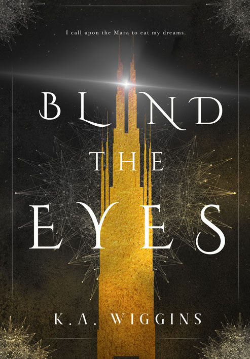
I flooded her with 10 pages (!!) of notes about genre, setting, symbolism and visual elements, inspiration, characters, etc. plus an overstuffed Pinterest board of cover inspiration, and she came through with a stunning concept that made sense of the chaos I dumped on her:
Here’s how some of those themes, plot elements, worldbuilding details, etc. informed the visual design:
The Tower
For those of you who haven’t had a chance to read BTE yet, the entire book takes place in (and under) a single tower in a flooded and monster–overrun city. The tower is a place of both refuge and oppression, as is so often the case, and defines the limits of main character Cole’s worldview and identity for much of this first book.
While technically fantasy, BTE also has a post–apocalyptic setting, and the Towers of Refuge are based on a real–world location: Bentall Centre, a series of integrated office towers built over an underground shopping mall in Vancouver, BC.
I love the way this blends gothic fairytale castle with imposing corporate monolith. The tower looms and bisects the flow of the page. The textured gold fill is simultaneously enticing and tarnished. Perfection.
Gold & Silver/Light & Darkness/Mist & Decay
I wanted to get away from communicating in terms of white and black/light and dark, so in the book (/trilogy), silver and gold are the most important visual cues.
Gold is extravagant, enticing, overwhelming, excessive, even menacing. It’s a glittering mask over reality. Silver is subtle, ephemeral, subversive, easily overshadowed, but also a bearer of light. It manifests in the margins with unexpected power (and readers may recognize a character–driven reason for the rooftop beam dominating the cover.
Both are present throughout the design, pushing against one another, holding the tension. Mist/fog is part of the worldbuilding, trapping humanity, corroding the city, and hiding the nightmarish Mara, and adds visual texture. The negative space of the title speaks to hidden realities, both truth and lies that hide in the shadows, exposed not by their presence but by the weight of their absence.
Threads/Networks
Cole exists in a world that insists on isolation, and she starts from a place of embracing that value. She quickly starts to question her world, discover what lays beyond its borders, and find the power to change the world and her place in it.
The interconnected threads/web visual elements speaks both to this theme of connection (both productive and destructive, illustrated by the gold and silver tones), as well as the powers that Cole begins to perceive and interact with.
It also just looks wicked cool . . .
Genre Crossover, Detail & Format
Cover design needs to meet readers’ expectations for the genre and perform on a functional level. Genre is MUCH harder to pinpoint than you’d think. It incorporates age group (MG vs. YA vs. adult), subgenres (is it Gothic fantasy? Gaslamp? Dystopian fantasy? etc.), and there are even differences between indie vs. traditional cover design trends within the same subject matter/subgenre.
In the case of Blind the Eyes, it hews closer to traditional/big publishing trends in YA fantasy (illustrated/graphic cover design) as opposed to indie trends (girls looking fierce with weapons and/or ball gowns), and I love it.
On the functional side, the cover needs to be eye–catching in small, thumbnail sizes, but still work at full–size and, in my case, various formats of print. Tucking enough detail so it doesn’t look raw and unfinished at larger sizes without muddying the form so much that it looks like a mess at smaller sizes is no joke, and colour profiles vary widely between digital and print formats. (Things look brighter on a screen, since they’re backlit, for instance.)
I’m in awe of how subtle, dynamic, and eloquent the design turned out, and I can’t wait to see how the designs for the sequel looks!